


Cauliflower Journals offers a wide range of journals which is excellent for me working as one of their graphic designers as it allows me to both expand my own creativity and meet expectations of the business.
These journal designs below are created by myself and available on the Cauliflower Journals website


FOREST LEAVES
Given an open brief at work to create a journal set inspired by nature, I took the opportunity to create cover designs inspired by my favourite designer, William Morris.
This has been one of my best-selling journals, likely due to the popularity of Morris and Co's style and the sage colours have been increasingly available in homeware fashion.

Spotted on The Tech Badger (Tiktok and Instagram)


Blue Lagoon
One of my favourite sets.
Using acrylic marbling paint for this set, I was not only able to get my eyes away from the screen but also learn a new skill that had been on my list to try for months!
The process came with it's challenges (e.g. getting the right consistency when mixing in the oil) but the end result came out beautifully with only light use of Adobe Photoshop for enhancements and collaging.


Being one of the UK's leading companies for the Christmas project (where students send in their designs to be printed onto cards, mugs and much more), we have thousands of organisers check out our website so it's important our site is up to date and has a playful and inviting theme.
Last September, I was tasked with creating the web page for our new playing cards. I needed to maintain the character and style of the rest of the site whilst also throwing in my own creativity through colour, images and site interaction.

Playing Cards

ABC Animals
For the new product, playing cards, it was important Cauliflower Group offered a range of games for all ages.
I created an ABC animals set as my first game. Aimed at children aged 3+. With 2 of each letter animal cards, I advertised this as a 2-in-1 game for Go Fish and Memory with feedback saying it has even helped children to learn how to spell their name in a more exciting way!
Kids Standard Set
My second game was a standard set with a playful and wild twist for kids. This was another popular set due to the endless games you can play with a classic card set but this had the added benefit of having a younger style for kids.

Personal Projects
PAINTINGS
Blue Abyss
acrylic and oil on canvas


Colours of Home
Inspired by the British countryside
Acrylic and oil on canvas


Dry Sea
Acrylic and modelling paste on canvas


PATTERNS & PRINTS
MAZE
Inspired by Saint-Émilion
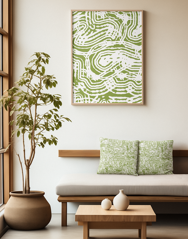


MAZE II
Inspired by Saint-Émilion


MAZE III
Inspired by Saint-Émilion
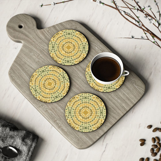


LOVE ME LILIES
Mum's favourite flowers


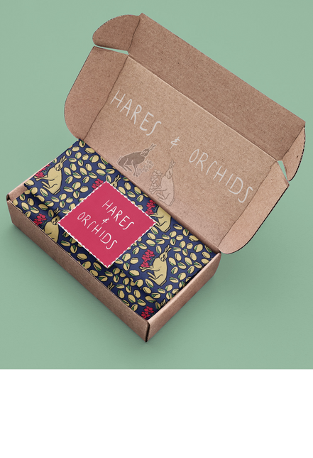
Hares & Orchids
Digital Pattern created with Procreate


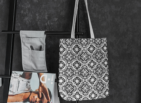
Night & Day
Digital Pattern using Procreate




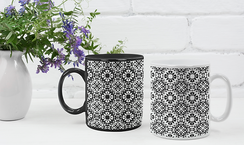
Blue Leaves
Pattern created using watercolour and Adobe Photoshop


Banana Flowers
Pattern created using watercolour and Adobe Photoshop


Billions of Bees
Digital Pattern created with Procreate


Midnight Meadows
Digital Pattern created with Procreate


ILLUSTRATIONS


 |  |  |
|---|---|---|
 |  |  |
 |  |  |


 |  |  |
|---|---|---|
 |  |  |
 |  |  |
 |  |  |
 |  |  |


Jewellery Design
Earrings and rings created using Polymer clay and Beads


WEARABLE ART
Double Femininity


Winners of ISA Fashion and Textile Competitions


Growth & Decay - 2016 award winner
Water States - 2017 award winner

Fashion Styling


Fashion Brand Concept

Monochrome fashion with timeless elegance
Personal Project working with AI

Brand Overview
Trinity is a womenswear fashion brand inspired by minimalism, precision, and balance. The collection is monochrome (black, white, and grey) and offers three length-based sizes: petite, regular, and tall. This consistent pattern of threes reflects my natural way of thinking and organising, shaped by my upbringing as the middle daughter of three and grown up subconsciously categorising into 3.
-
Palette: Black | White | Grey
-
Sizes: Petite | Regular | Tall
-
Focus: Timeless, versatile pieces with an emphasis on fit, proportion, and quality
“Trinity interprets trends through shape and structure rather than colour, creating pieces that remain relevant season after season.”
Design Philosophy
-
Limiting the palette allows detail, craftsmanship, and proportion to take centre stage.
-
Every garment is designed with attention to silhouette, fit, and construction.
-
The boutiques are what introduces colour: the boutiques feature a single accent colour each year, selected based on muted-tone trend forecasts. This approach enhances the monochrome garments, making them pop against the curated backdrop.
“Quality over colour. Precision over excess.”
Brand Positioning
-
Aesthetic: Chic, refined, luxury-inspired
-
References: Chanel, Prada
-
Accessible Pricing: Comparable to Mint Velvet and Jigsaw
-
Sustainability: Designed to last, rejecting fast-fashion practices
Brand Values
-
Timelessness: Monochrome pieces that never go out of style
-
Inclusivity: Petite, regular, and tall sizing
-
Craftsmanship: Focused on fit, structure, and quality materials
-
Sustainability: Thoughtful production for long-lasting wear
Added Value
-
Trinity understands the frustration of purchasing clothing that still needs altering. To make the process easier, Trinity boutiques offer in-house tailoring, allowing customers to adjust garments for the perfect fit at the point of purchase.
-
This service enhances the shopping experience while reinforcing the brand’s focus on quality, craftsmanship, and attention to detail.
-
Clothing designed to fit and tailored to you.
Target Audience
Style-conscious individuals seeking versatile, minimalist fashion with refined proportions and sustainable values.


Store Design
Trinity boutiques are designed as small, boutique-style spaces that complement the brand’s minimalist clothing. While the garments remain monochrome the interiors introduce a single accent colour each year, this is important as it will draw customers into the store.
This annual colour is carefully selected based on muted-tone trend forecasts, creating a cohesive, contemporary backdrop that allows the clothing to stand out. Walls, tables, and display fixtures follow this colour palette, turning each store into an immersive, curated experience.
“The space becomes part of the story: simple, refined, and ever-changing, while the clothing remains timeless.”


*please note this is not a real fashion brand, this showcases my creative thinking and ideas
PHOTOGRAPHY
Type 1 Diabetes Awareness


Body Glitch


Glitter Me


